Icon Design
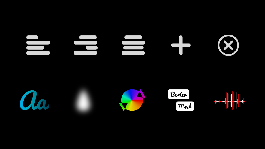
While I’m not much of an illustrator, icon design has been an interest of mine for a long time. It’s a precise yet flexible form of communication, and I enjoy the iterative process that comes with it. A selection of icons that I’ve created are shown below, as well as on each project’s page.
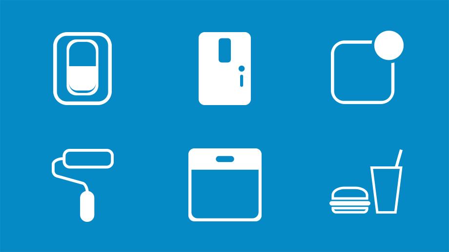
Mochila was an app for university students that I co-created and designed. I created a wide variety of icons for the app, website, and marketing in the three years that we worked on it. A few of my favorites are featured below.
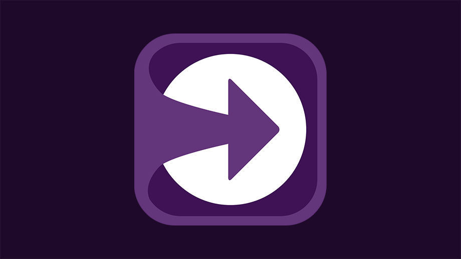
UpNext is a new app I worked on for 88 Oak, offering a simple yet attractive way to countdown to future dates and times. The app icon for UpNext needed to look great in any color, since one of the perks of the Power Pack upgrade is an array of color themes and matching icons.
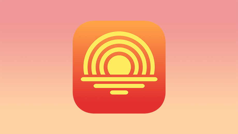
Suncaster is a new podcast app, featuring an opinionated take on podcast listening. With its unified timeline, it provides a great way to stay current on serialized podcasts where new episodes continuing the story of the season are released on a regular basis. Plus it provides a great way to catch up on shows you missed, with a unique icon system denoting status of each episode. I had the great chance to design the app icon after meeting the app's creator at Layers in San Jose, and beta testing the app over the summer. Combining the iconic image of a sunrise with the all-too-common image of podcast waves, this icon stands out while (I feel) conveying that it's a podcast app.
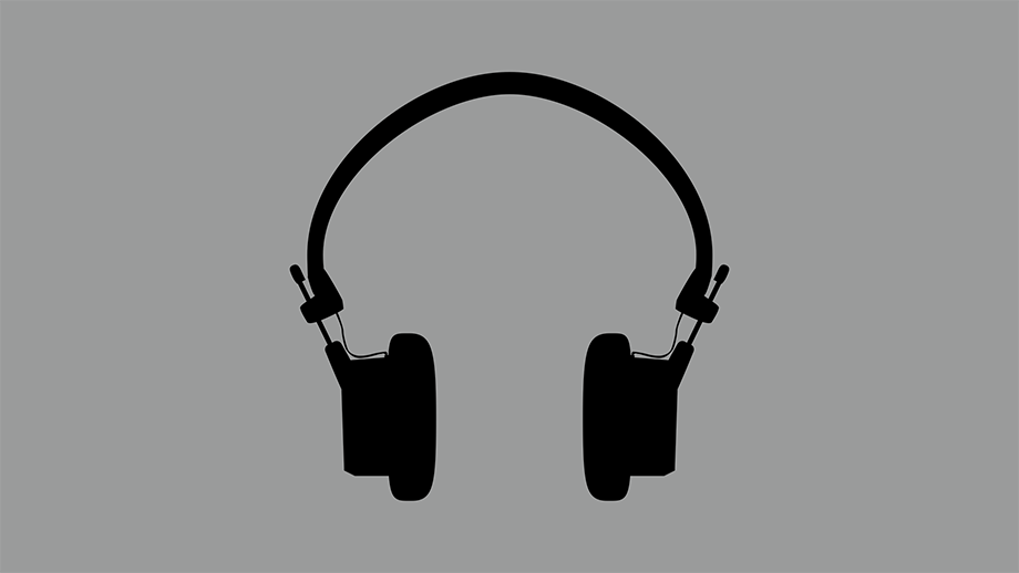
I drew these headphones for the branding for the Blue Angels Drill Team 2019 Don’t Stop the Music, where my wife was Director. They were the central part of the promotion for the show, and the cover of the show program. They’re modeled after Grado’s iconic and legendary headphones, and I created an open variant as well to allow text to be placed inside the two sides. This version shown here is the regular “closed” version.
For Muse’s editing interface, I created an assortment of icons for varying tasks such as alignining, adding, and removing elements. In addition, we needed icons for each drawer in the interface. Working with the client, we had some fun with these being multi-color icons with gradients and even blur effects where it made sense.
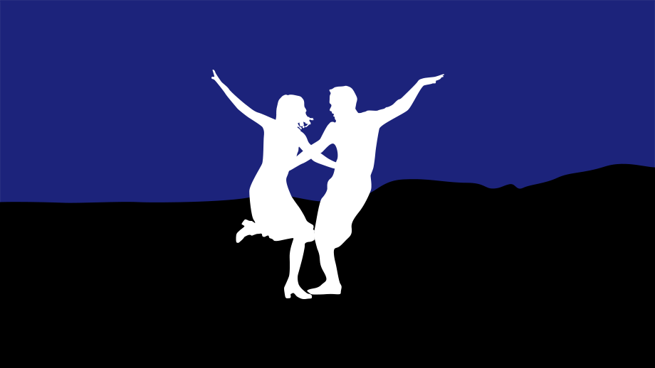
This film was one of my favorites from 2016, and it inspired me to take a stab at drawing an icon of the scene depicted in the poster. It turned out really well, and it was great to practice drawing with the Apple Pencil and Astropad.
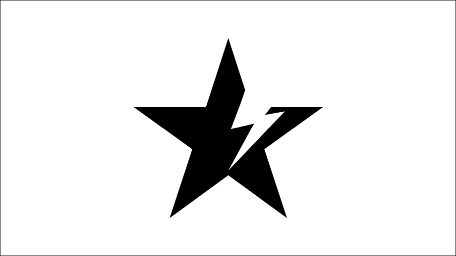
In honor of the late great David Bowie, I designed this as a combination of what I feel are two of Bowie’s most notable images and album covers. ★
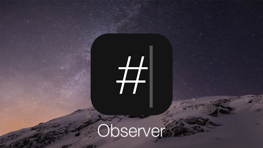
Social media offers a ton of opportunities to businesses. Observer lets you put those social media posts up for others to see, wherever you choose. You can use the iPad's built-in display, or with With HDTV-Out, your iPad becomes a control panel for a beautiful, custom-designed, adaptive-format gallery of photos and tweets. I designed the user interface, icon set, and app icon. Observer is no longer available.
A different sort of Twitter client, which lets you secretly follow anyone without them knowing. The user interface and experience design was a collaboration between myself and our engineer on the project.
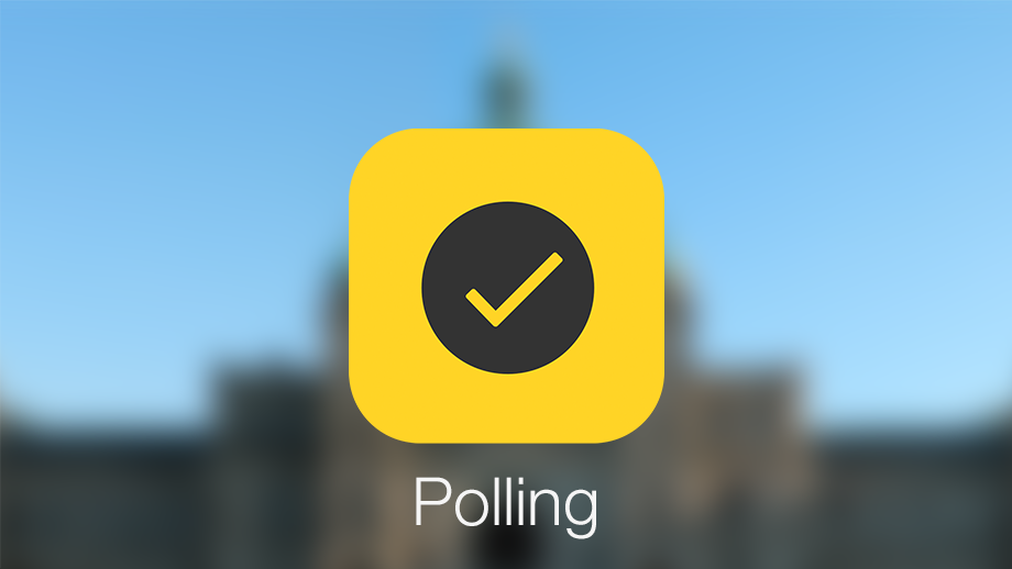
A rather simple icon for a political polling app that we worked on at 88 Oak for two years. I also created the user interface for both iOS and web app, as well as the in-app icons.
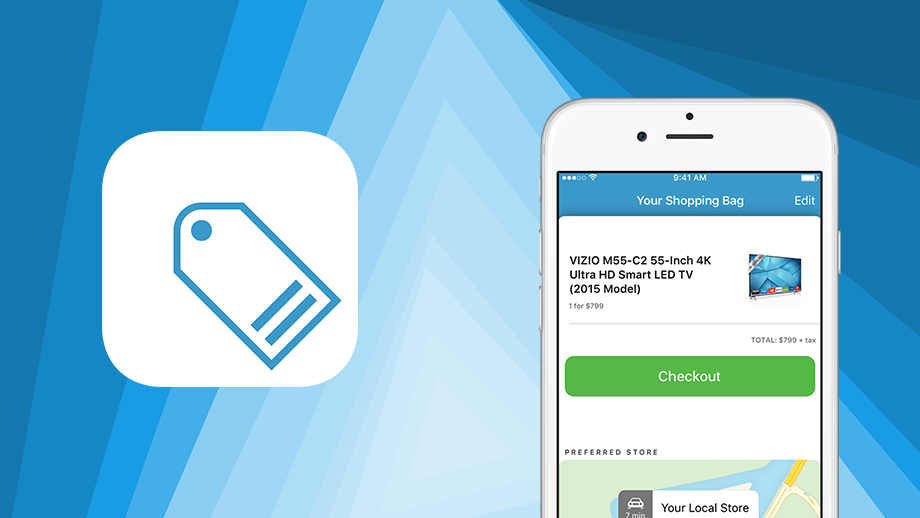
In early 2016 I worked on a proof of concept for a white label iOS shopping app. The app focused on having a simple way to browse and search the store’s inventory, as well as ordering for pickup at a local store. I designed the app’s interface, as well as an on-boarding experience.
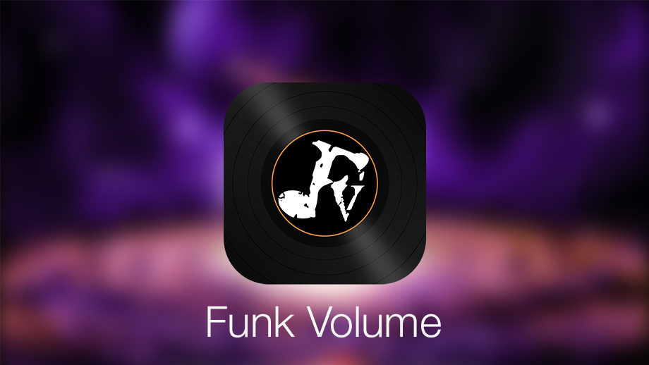
One of the great customers we've helped at 88 Oak was Funk Volume. We created both iOS and Android apps for them, and this app icon was an unused concept featuring their existing logo.
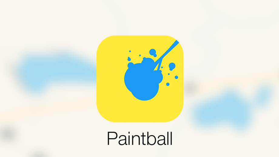
This icon was great fun to create, and went along with an equally fun and vibrant interface. The app was a consumer app for a paintball field company which never progressed forward.
See more of my icons on Dribbble.