After the 2018 election, I wanted to create a prospective brand for a prospective Castro campaign after hearing Julián speak on his plans to run in 2020.
My design incorporates the acute into a cutout on the letter "N" and embraces the acute as a branding element and the icon of the campaign. Much like the icons of Clinton and Obama’s campaigns, it’s a simple shape that can be easily adapted while remaining recognizable if it were used as a primary branding element.
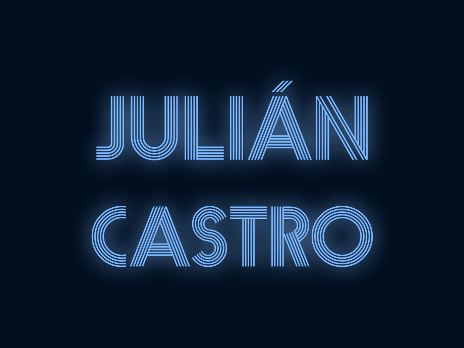
The typeface primarily shown here is Prisma, a free font by Dieter Steffmann that I’ve adapted from the styled lines that evoke a neon sign into solid shapes for the wordmark. Also featured in this concept is Brandon Grotesque in “For President” and website content.
I chose to focus on bright shades of blue and red as the primary colors for this project. While some campaigns have had luck with establishing alternative colors and bucking the endless sea of red/white/blue logos —Beto’s black & white logo, and Ocasio-Cortez’s purple posters come to mind— I do think it is a good starting point. Similar bright colors covering the rest of the spectrum could be used and would retain the friendly feeling I sought with this strong blue color.
The Icon · The acute, and could be a fantastic piece of branding for the campaign. After hearing Julián discuss his consideration of running, he made a comment about how 2020 would be the first national election to have yard signs with an acute accent. This really stuck with me. It makes for a simple, and distinct icon. And, in the crowded primary process, this will be essential to stand out.
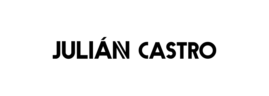
The Wordmark · Featuring a cutout on the letter “N” and embraces this branding element in the icon. It helps to provide something more distinct than another bold, uppercase typeface for a logo that is all too common in political campaigns. This also allows Julián’s first name to be used on its own, while still maintaining a distinct branding element that campaigns usually lack.
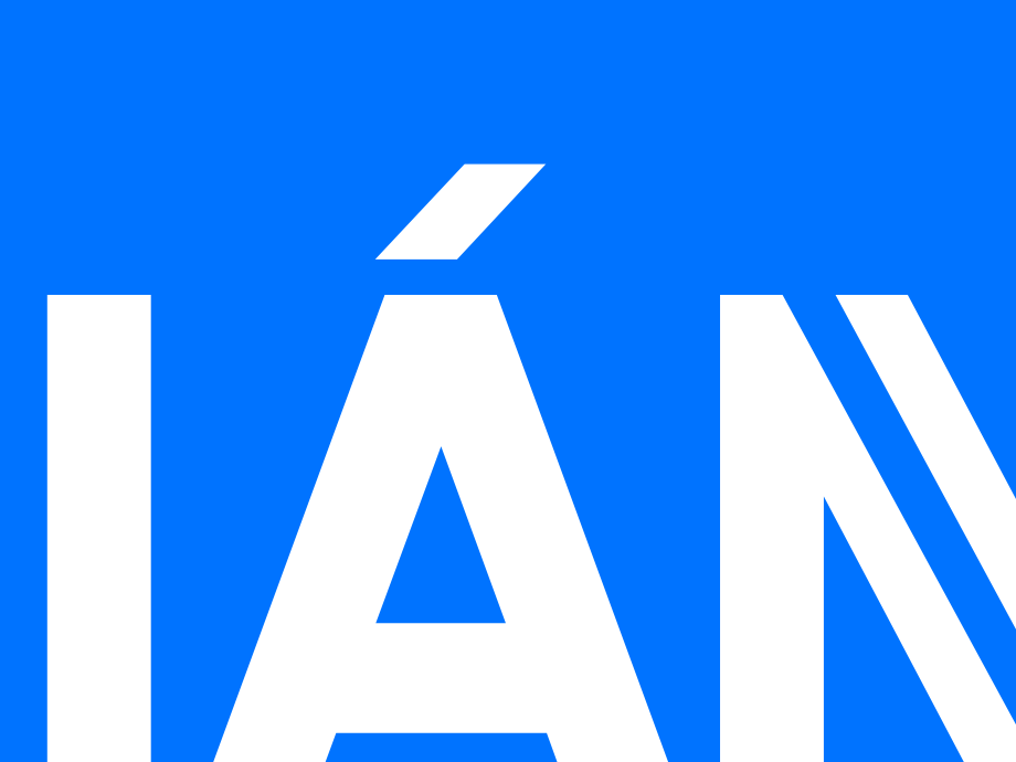
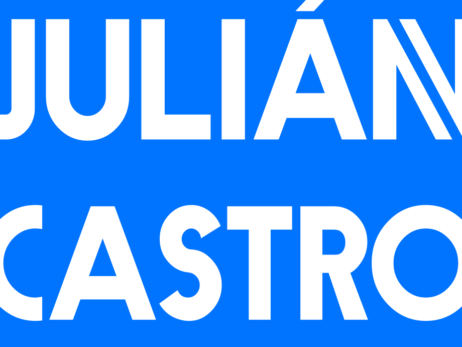
The Details · The cutout of the letter “N” is optically aligned to the size of the acute, which is visible in detail crops such as this first one. The second detail shot shows how this word mark can be used in the full frame, without losing any of the details as you can clearly read Julián’s full name even zoomed in.
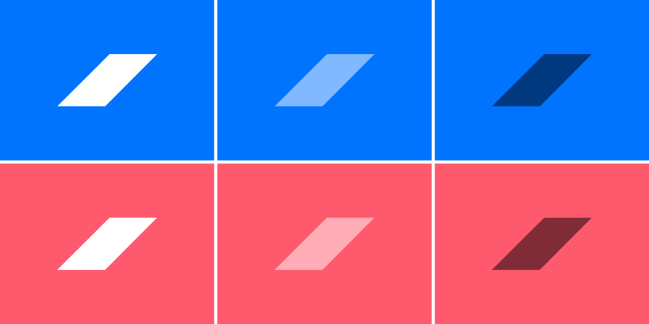
The Core Colors · The primary and secondary colors can be adapted through a variety of opacities as needed, resulting in an array of friendly and optimistic color pairings. The use of a single color in each instance of the logo’s usage was an important piece of the color selection. In the website example below, tinting photos for marketing materials can bring a strong association with a color to the campaign.
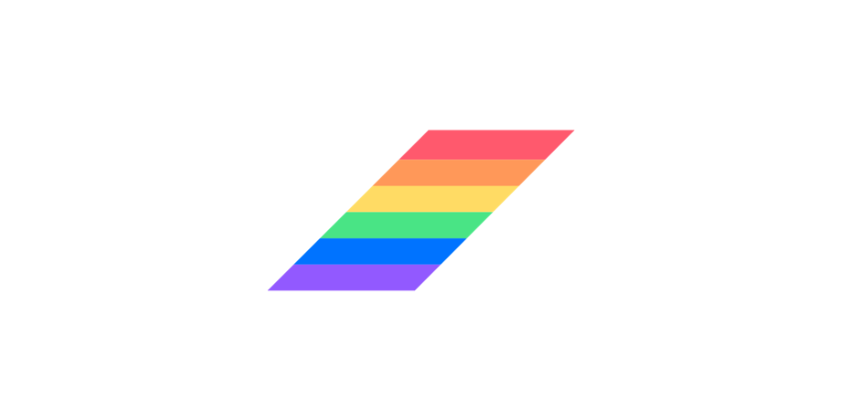
Other Colors · In addition to the primary and secondary colors at their varying opacities, I also selected companion colors across the spectrum to create a Pride variant of the logo shown above. These colors work with the primary and secondary, and could also be used across a wide variety of sub-branding opportunities of course. They also help show that variants of a core design are not an afterthought, as is often the case in some campaign branding work.
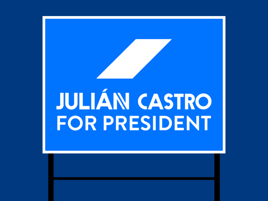
The Yard Sign It’s only right to view this design in context on a yard sign, after Julián’s comment on the acute was part of the inspiration behind this direction. While it’s simple, I believe a strong focus on the acute early on in the campaign could help make it a strong icon in the packed Democratic primary field, and in the general election.
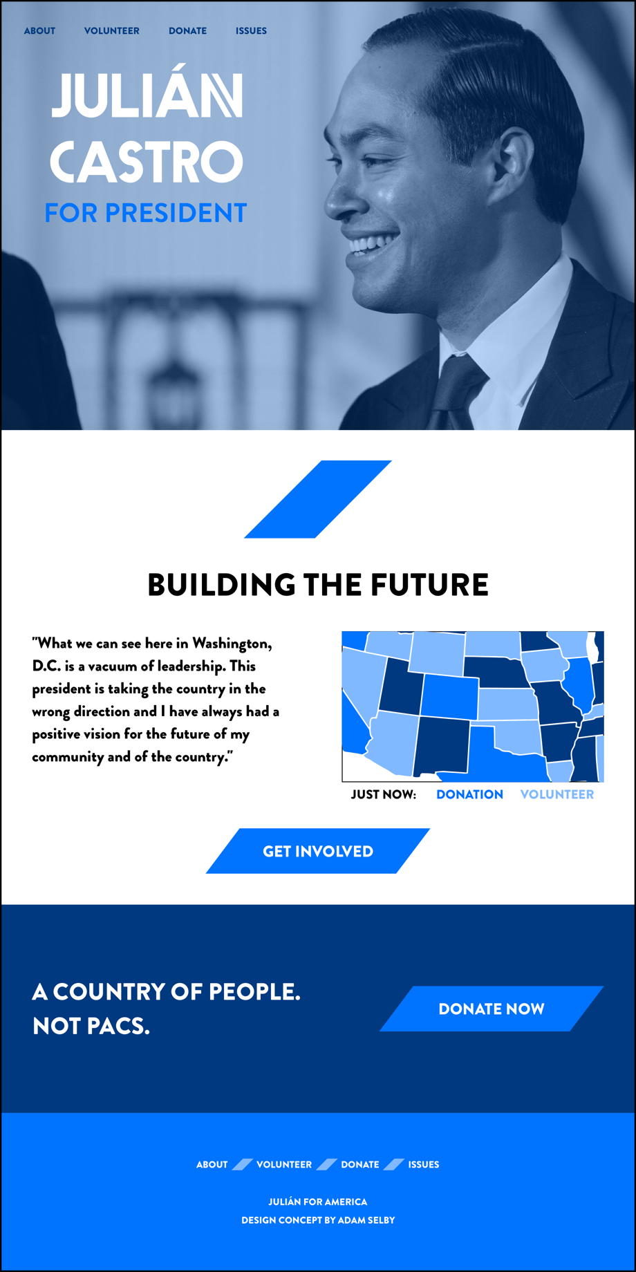
The Website · As mentioned earlier, the single color can be used to tint a photo, and tie the color to the campaign in a strong way. Using blue as the primary color in this concept, the hero shot at the top of the website features a slight blue tint, reinforcing the hopeful feeling of the blue. Outside of the branding area of things, I’ve explored the idea of a map showing realtime supporter activity across the country. I think there’s a great untapped potential in exposing recent donations, and recent volunteer activity across the country. Not only could it motivate someone to volunteer, it also holds the potential to show the unity this campaign could bring across the country. The effect of people seeing volunteer activity in Arizona could lead to the advantage needed to take states that might normally be ignored.
Thanks for checking it out!
